Blog

Breaking Change Approvals
Combine schema proposals with operation checks for fine-grained breaking change management

Introducing Audit Logs
Track and analyze organization activity with comprehensive audit logging

Native Single Sign-On in the Enterprise Platform
Introducing native OpenID Connect based Single Sign-On support in Grafbase Enterprise Platform for seamless authentication across your organization.

Benchmarking GraphQL Federation Gateways - September 2025 Edition
Performance analysis of GraphQL Federation gateways across real-world scenarios

How commercetools uses Grafbase to support multi-tenancy, feature flagging, and AI innovation
Learn how commercetools leverages Grafbase Extensions and MCP server to implement multi-tenant GraphQL Federation, feature flagging, and AI-powered developer experiences at enterprise scale.

Modernizing GraphQL at scale: How Pantheon implemented secure, scalable federation with Grafbase
How Pantheon unified their web operations and accelerated development with Grafbase Federation.

Seamless gRPC to GraphQL Federation with Grafbase Extensions and the Composite Schemas spec
Learn how to seamlessly expose gRPC services as a federated GraphQL API using Grafbase Extensions and Composite Schemas for a unified API experience. Declaratively orchestrate and join calls to your existing gRPC services. Adoption is easy, without new infrastructure or code.

Announcing Schema Contracts
Define and enforce specific schema subsets for enhanced security and control

Announcing the Grafbase remote MCP server
Interact with the Grafbase API from any MCP-enabled AI application with the Grafbase Remote MCP. Built with the same Gateway built-in MCP you can use for your own GraphQL API.
Beyond Apollo Federation - How to use Composite Schemas and Extensions to integrate non-GraphQL data sources
Integrate non-GraphQL data sources like REST APIs and gRPC services with Composite Schemas as Grafbase Extensions
Announcing OAuth 2.1 support in the Grafbase MCP server
Introducing full OAuth support in the MCP server, enabling secure authentication and authorization for your applications.

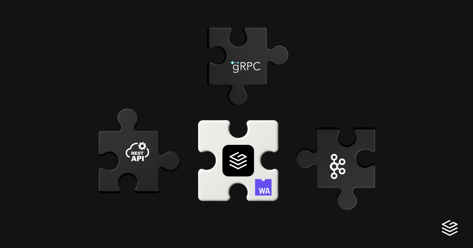
Extend REST and gRPC APIs with GraphQL using Grafbase
Learn how to expose gRPC and REST services as GraphQL subgraphs using Grafbase without rewriting or proxying your existing systems.